In Defense of the Apple Watch Honeycomb App Picker
Since watchOS 1, the default honeycomb app picker has been derided as one of weakest parts of Apple Watch. A lot its criticism stemmed from the fact that watch apps were pretty useless before watchOS 3, but it is still considered a bad interaction model for launching apps now.
Basically, it looked cool but was horrible to use.
watchOS 3 introduced the Dock, which let users put their favorite apps in a short list for easy access (with the added bonus that apps in the Dock were kept in memory and did not need to be relaunched every time the user opened them). watchOS 4 added an option to replace the honeycomb with a simple alphabetical list of all the apps on the watch. Once that option was available, I switched to it and promptly forgot about the honeycomb.
Until this summer.
As apps on the watch became more useful, I find myself using them more than I used to. I now regularly use more apps than I can keep one my dock, so I end up having to go back to the full list of apps more often that I would like. While finding an app by name in an alphabetical list is easier than scrolling around the honeycomb finding the right icon, it is still too slow for the watch (where total interaction time should be under five or ten seconds).
The solution to this problem ended up being the honeycomb.
I made a list of apps that I used regularly and put them into three categories:
- Apps that I primarily interacted with via complications
- Apps that had useful display info
- Apps that were only useful when using
Complications
For the first group, I just set them up as Complications. Notable apps here include the Activity app, CARROT Weather, and Streaks. These apps just live on my watch face, so they are not included in the Dock or near the center of the honeycomb.

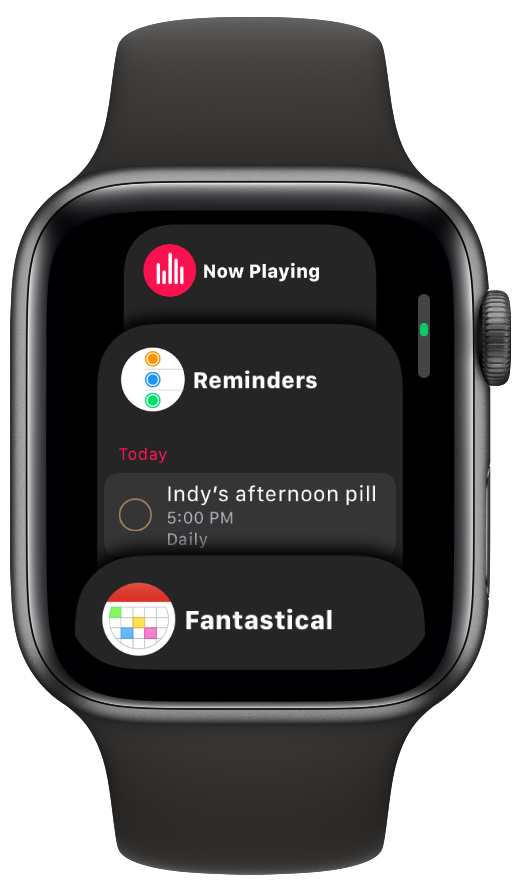
The Dock
For apps that I use often that have valuable information to display even when I am not using them, I use the Dock. I use the setting to show my Favorite apps instead of Recents (for consistency and muscle memory). My dock consists of Now Playing, Reminders, Fantastical, RadarScope, and HealthFace.
This option was a bit more useful with my old Series 3 Watch than it is on the Series 4. The Dock has been slightly redesigned on the Series 4 to only show about half of the apps at a time. This makes using them for quickly glancing information much less convenient. So I could see myself switching the dock to the Recent setting and spreading these apps among the honeycomb (more or this in a minute) and my watch faces. Adding these apps to watch faces is much easier with the new Infograph face (but I would prefer that Apple just fixed the dock to be more useful on the Series 4)1.
The Honeycomb
The last step to my organizational strategy is the home screen. I switched it back from the list to the honeycomb and organized how the default view looks (before you scroll anything around). I broke my other apps that I routinely used into categories and organized them around the center by those categories. I have audio apps (Music, Podcasts, and Radio) on the bottom right. I have communication app (Messages, Phone, and Radio) on the bottom left. I have health apps (Workout, Streaks Workout, Heart Rate, and Breathe) on the top. And I have other miscellaneous apps (Maps, Wallet, Alarms, 1Password, and PCalc) filling in the missing spaces.
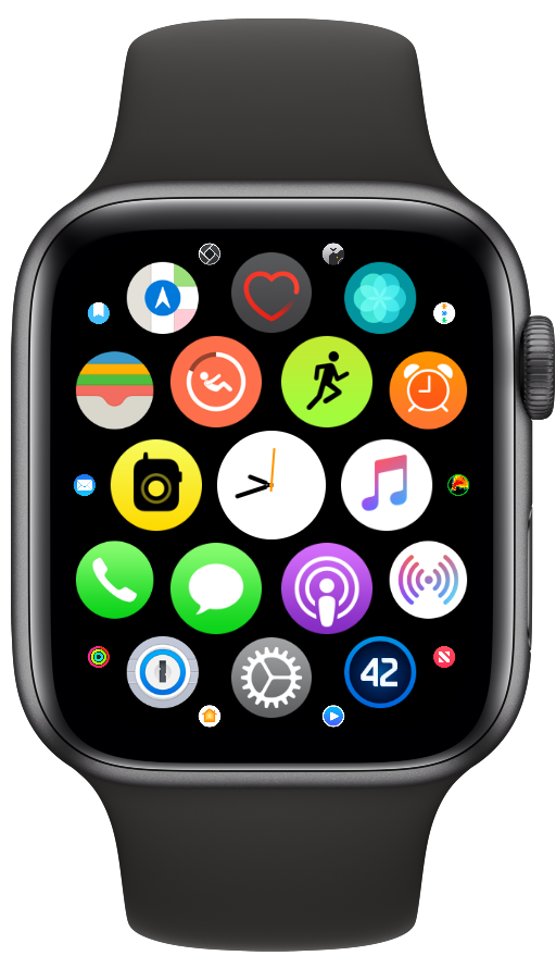
The rest of the honeycomb is not organized at all, because I never have to use an app that is not already covered above.
Unlike the apps launched from Complications or the Dock, apps on the honeycomb are not kept in memory and must be launched from scratch when tapped on. Before when launching took 5 seconds or more, this was enough to make me never use them. While using the Series 3 over the summer, I realized that I was able to launch apps in under a second. Now on my Series 4, it is instant.
With this organizational system, I have build up muscle memory for launching apps. I no longer have to navigation an alphabetical list of apps to find the one I am looking for, because any app I am looking for is either release showing on my watch face or is quickly accessible through either one tap of the crown or one tap of the side button. Four years into using the Apple Watch every day, I finally enjoy using the honeycomb.
-
This has already begun a little. With my current watch face, I already have 3 of the apps that were on my dock before represented by complications (in addition to still being in the dock). ↩︎